 CONSUMER_APP_INDEX
Funnel Walk · October 22, 2026 · ~7 min read
39 screens to a $19.99 plan: SolSpace's men's Kegel funnel, start to finish
A brand-new web2app player is buying YouTube and Meta traffic into a quiz about the most private problem a man has. We walked every screen. Here is how it earns the sale, act by act.
Funnel Walk · Consumer App Index · October 22, 2026
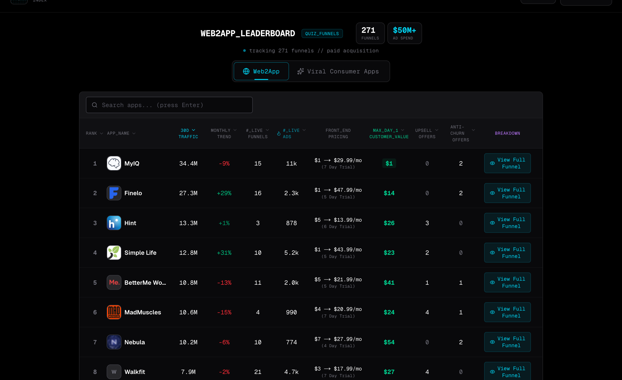
The “Bloomberg Terminal” for Web2App Quiz Funnels
Track the ads, funnels, and pricing of every major web2app player — new funnels land in the terminal the same week we capture them.
Already a member? Open SolSpace in the terminal → all 53 screens are inside
- 🚪 A landing page with no pitch: the first screen is already question one
- 🩺 24 questions that turn embarrassment into a number, then sell the number back
- 🏃 The paywall, the checkout, and the 75%-off offer that fires when you try to leave
SolSpace is a newcomer, and it is already running the full playbook: a ten-minute timer, a pre-selected plan, a per-user discount code, and an exit offer. Walk it with us.
Act 1 · The door · Joseph SugarmanThere is no landing page. There is only question one.
You arrive from a YouTube ad and the first thing you see is four men and four age brackets. No headline about results. No “Start quiz” button. You tap your age, and you are in.
Screen two is the only pitch in the funnel, and it is five seconds long: a crowd of men, a membership number, three press logos, Continue. Then the questions begin, and they begin with the goal, not the problem.
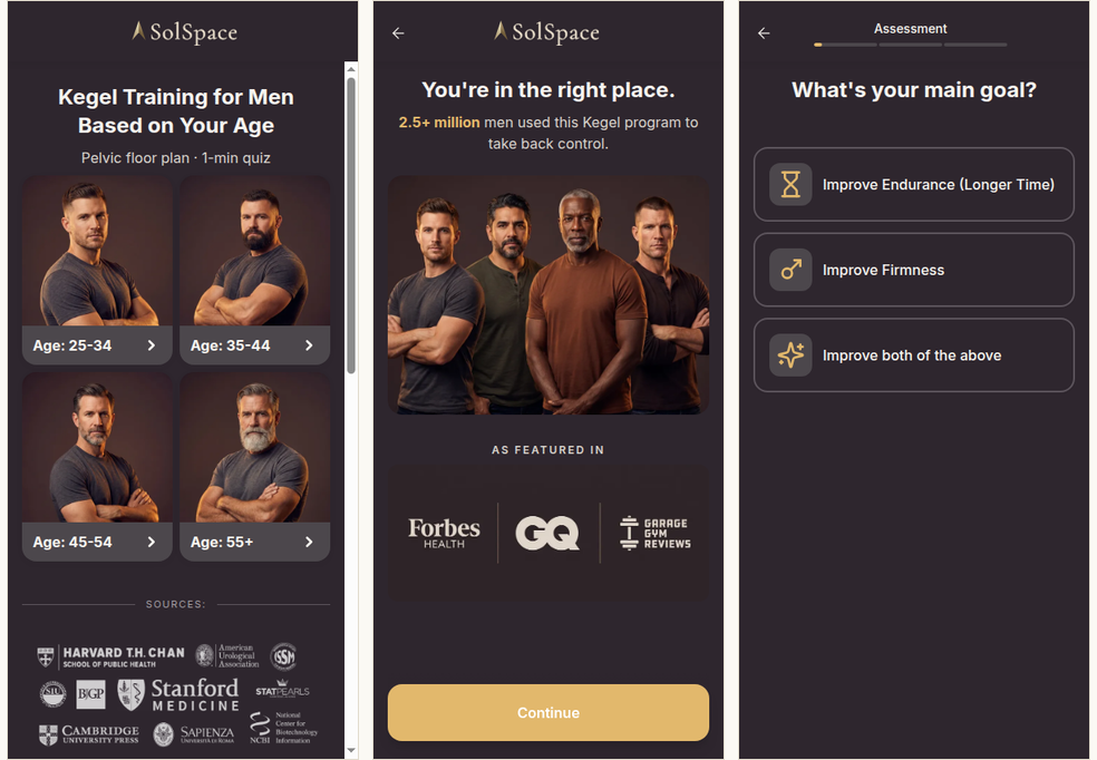
Make your first screen a one-tap question about them.
Age is the easiest yes there is. Everything you would normally say first can wait until screen two, where the reader is already moving.
Six blunt questions, asked like a doctor
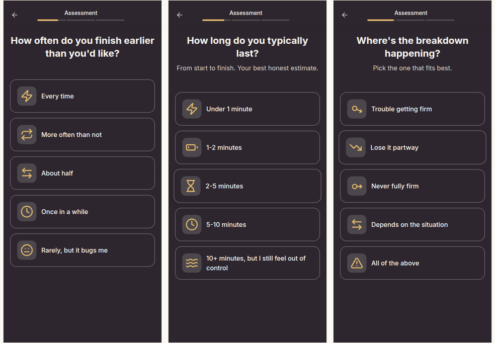
The “Assessment” section asks how often you finish early, how long you last, and where exactly things go wrong. The tone is clinical. Each answer has an icon. Nothing is softened and nothing is judged.
That bluntness is a feature. A man who answers “2–5 minutes” and “lose it partway” has just described his problem in more detail than he ever has to a doctor. He is now invested in what the funnel says next.
Four times in the walk, the funnel swaps the menu for a 1–5 scale: control with a partner, firmness, daily stress, and confidence. Those four taps are not for your benefit. They are the raw material for the score the funnel prints at the end.
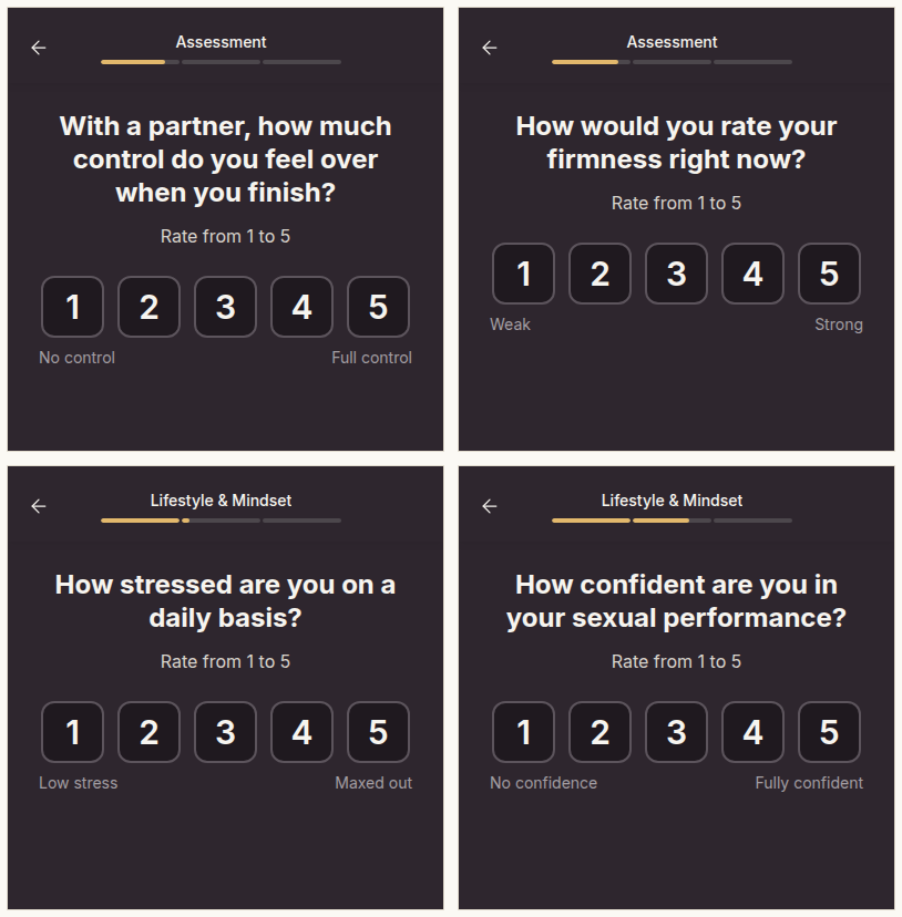
Ask for numbers you can hand back later.
A 1–5 scale costs the user one tap and gives you a specific to print on the results page. Specifics get believed. “Your control: 3 of 5” lands harder than any adjective.
The confession section
Halbert taped a dollar bill to his letters so your hands were on the page before you decided to read. SolSpace's version is a run of nine questions about sleep, screens, porn, masturbation, and the voice in your head during sex.
Watch the copy under the hardest question: “This is data, not a lecture.” One line, and the shame is gone. The man keeps answering. By screen 21 he has told a stranger things he has told no one, and walking away now would waste all of it.
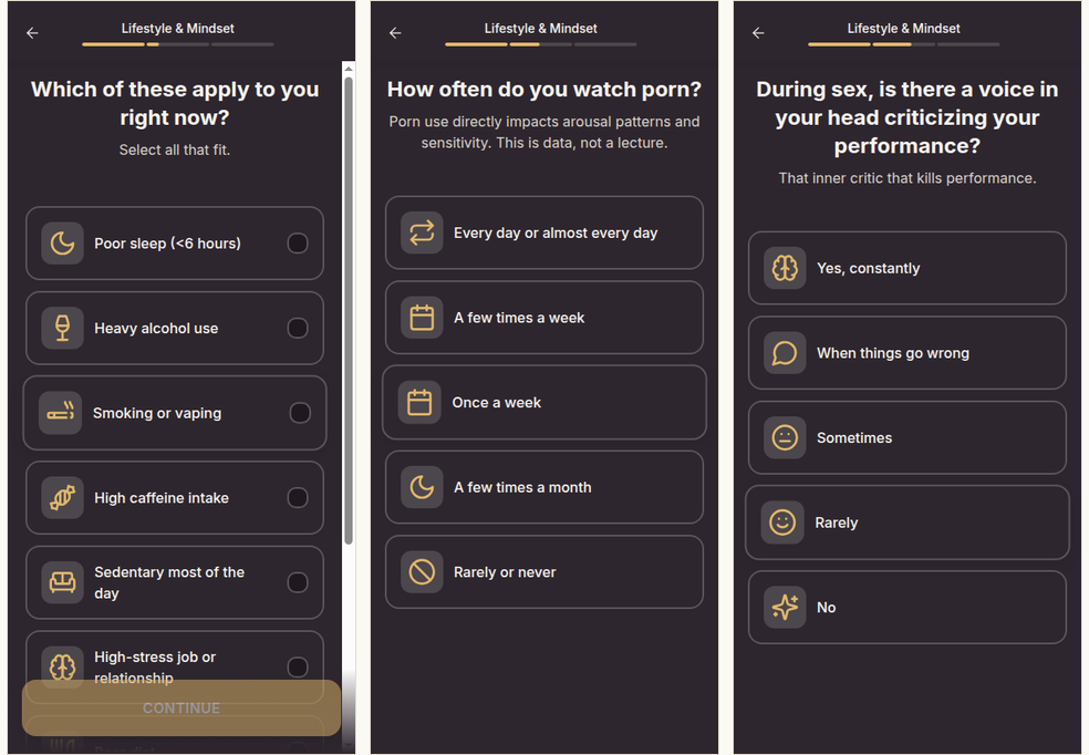
Disarm the hard question in one line, then ask it anyway.
The deeper the question, the bigger the investment. Pair each uncomfortable ask with a sentence that removes the judgment, and the drop-off you fear mostly does not happen.
Every fourth screen is a reason to believe
Ten of the 39 screens are not questions at all. They are interstitials, and they are placed with care. Right after you pick a goal, a percentage. Right after the confession run, a group photo and “you're not alone.” Right after the pills question, a split image of pills against a sprinting man.
That last one is the Schwartz move. The man already wants what Viagra promises. The funnel does not argue with that desire. It points it at training instead: pills wear off, muscles stay. The desire was already there; only the product changed.
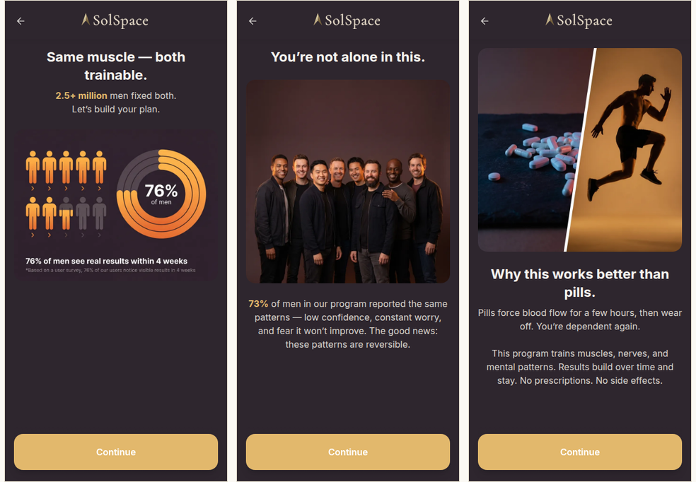
Put a proof screen immediately after each painful answer.
The moment someone admits the problem is the moment they most need to hear it is common and fixable. Schedule your proof by emotion, not by screen count.
Three universities, then a muscle that gets redder every week
Before the funnel asks for any commitment, it shows the product. First a screen of crests: Cambridge, Harvard, Oxford. Then three “Step” screens that preview the plan, and the first of them is the cleverest image in the funnel.
It is a pelvic-floor muscle drawn four times, Day 1 to Day 28, each one thicker and redder than the last. No chart, no numbers. You can see the result before you have paid for it.
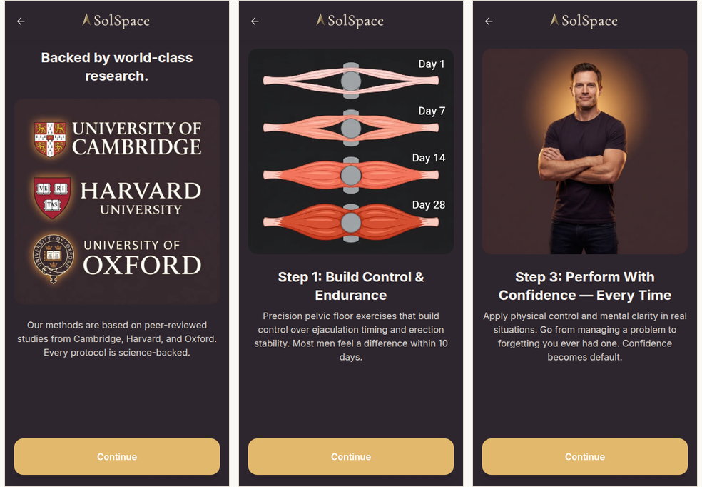
Draw the transformation; do not describe it.
One illustration of the thing getting better over four weeks does the work of three paragraphs. If your product has a visible mechanism, show it before the paywall, not on it.
Three questions that are really three commitments
The last section is labelled “Your Plan,” and the questions change shape. How much time can you commit daily? When do you want results? What does success look like for you?
None of these diagnose anything. They are the user writing his own order form. Ten minutes a day, results within a month, “all of the above.” When the plan appears two screens later, it matches what he just asked for, because he just asked for it.
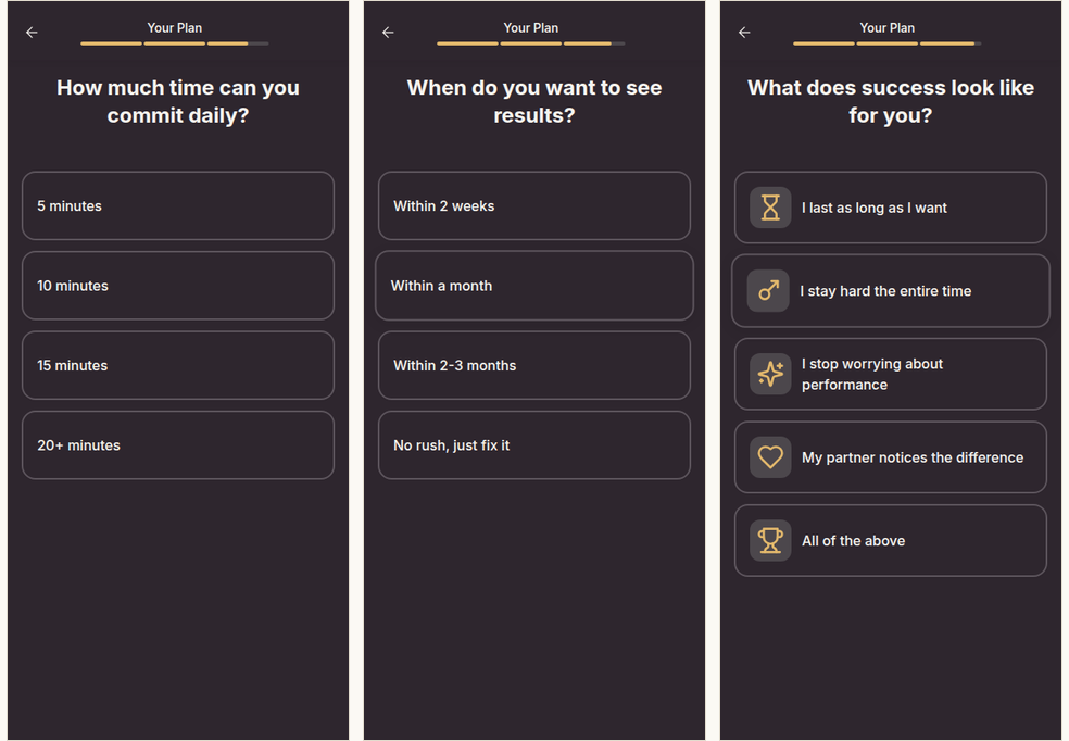
End the quiz with the user's own terms, then quote them back.
Time, timeline, outcome. Three taps, and the paywall is no longer your offer. It is the plan they specified.
A score, a loader with a question inside it, and only then the email
Hopkins believed in the free sample. SolSpace serves it at screen 35: a gauge pinned at the “Low” end, a red card, and six readouts built from your answers, including a “Main blocker” with a medical name. It reads like a lab result.
Then the loader. Reviews blur in the background, a ring fills, and at the halfway mark the screen stops and asks one more question: “Do you want to feel more confident in bed?” Yes or No. Only after that yes does the email field appear, and only after the email does the four-week chart.
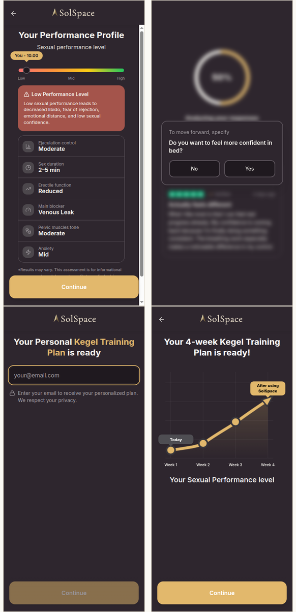
Pay the user off before the email ask, then collect one more yes.
The score is the sample. The mid-loader question is a free micro-commitment at the moment of highest attention. Both cost nothing and both arrive before you ask for anything.
Timer at the top, the plan already ticked
The paywall is one long page. The elements that do the selling are all in the first two screens of scroll, and the rest is a proof stack: plan curve, review wall, schedule grid, guarantee, FAQ.
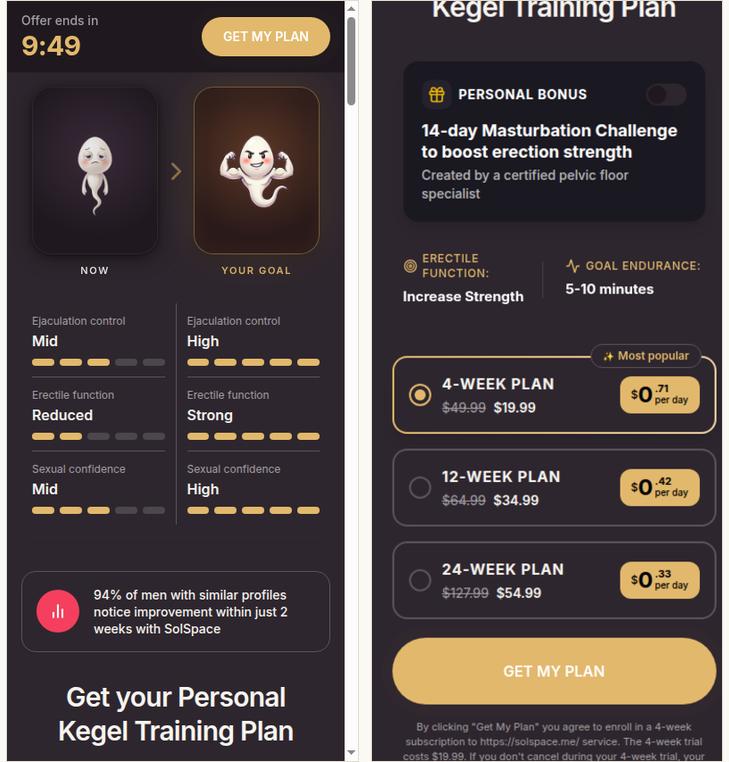
Six things above the fold
- A ten-minute clock in the sticky header, next to the only button on the page.
- Now vs Your Goal avatars, with the “Now” readouts copied from the quiz score.
- A fresh stat card: “94% of men with similar profiles notice improvement within just 2 weeks.”
- A “Personal bonus” toggle, off by default, for a 14-day challenge. Its price is never shown here.
- Three plans, the cheapest entry pre-ticked and tagged Most popular. Prices are framed per day.
- The renewal terms in grey, under the button, and they change with the plan you pick.
USD as captured on Oct 21 through a US exit. Renewal terms read from the fine print with each plan selected.
Carry the quiz score onto the paywall and put the clock next to the button.
The “Now” column is the user's own answers reflected back. The deadline is visible at the exact point of decision, which is where Halbert said it belongs.
Close the checkout and the price drops again
Tap GET MY PLAN and a checkout modal opens with the discount itemised: full price, minus the intro discount, total today. Close that modal and the funnel does not let you go.
A second modal fires with a 75% starburst, a with-and-without checklist, and a promo code written into the copy. Accept it and you land on a “Best Offer” page with its own, shorter timer and a lower per-day price. Hopkins keyed every coupon so he could trace the sale. A code that only appears to leavers does the same job: anyone who redeems it is counted as a saved abandon.
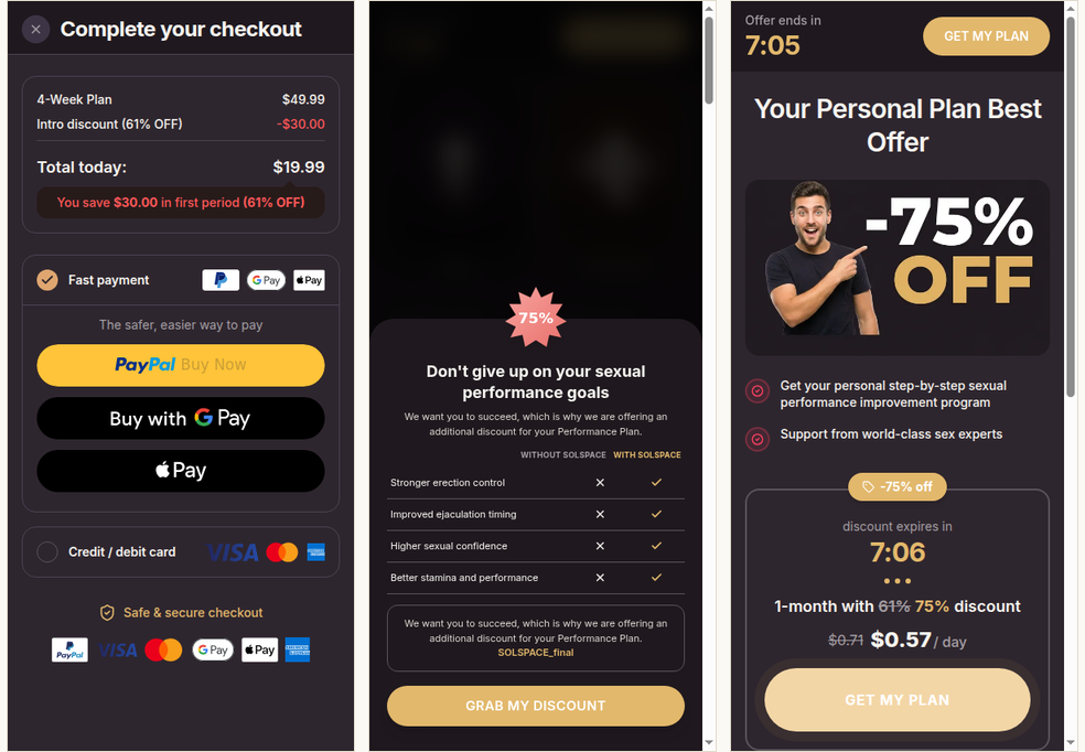
Build the second offer before you need it, and key it.
A shorter term at a lower entry price catches the man who balked at the first one. Give the exit offer its own code so you can see exactly what it saves.
The question inside the loading screen. Halfway through “Analyzing your responses,” SolSpace pauses the ring at 50% and asks “Do you want to feel more confident in bed?” One tap, then the loader resumes. It costs a modal and a timer to build. It gets a yes at the moment the user is most curious, and it hands your email screen a reader who has just said he wants the outcome.
All 53 SolSpace screens, every price, and the ads driving the traffic are in the Consumer App Index terminal.
250+ web2app apps tracked. New funnels captured the same week they surface, walked screen by screen so you can study the plays before your competitors do.
Get the full web2app funnel library →Already a member? Open SolSpace in the terminal →
Until the next walk,
— Consumer App Index
100+ captured quiz funnels, paywalls included: consumerappindex.com/terminal — already a member? That link is your fastest way back in.
