 CONSUMER_APP_INDEX
The June 2026 Web2App ad swipe file
We analyzed the top web2app Meta ads running in June 2026. Five angles keep showing up, in every vertical, in six languages. Here they are with the on-screen scripts and the live creatives, so you can steal them this week.
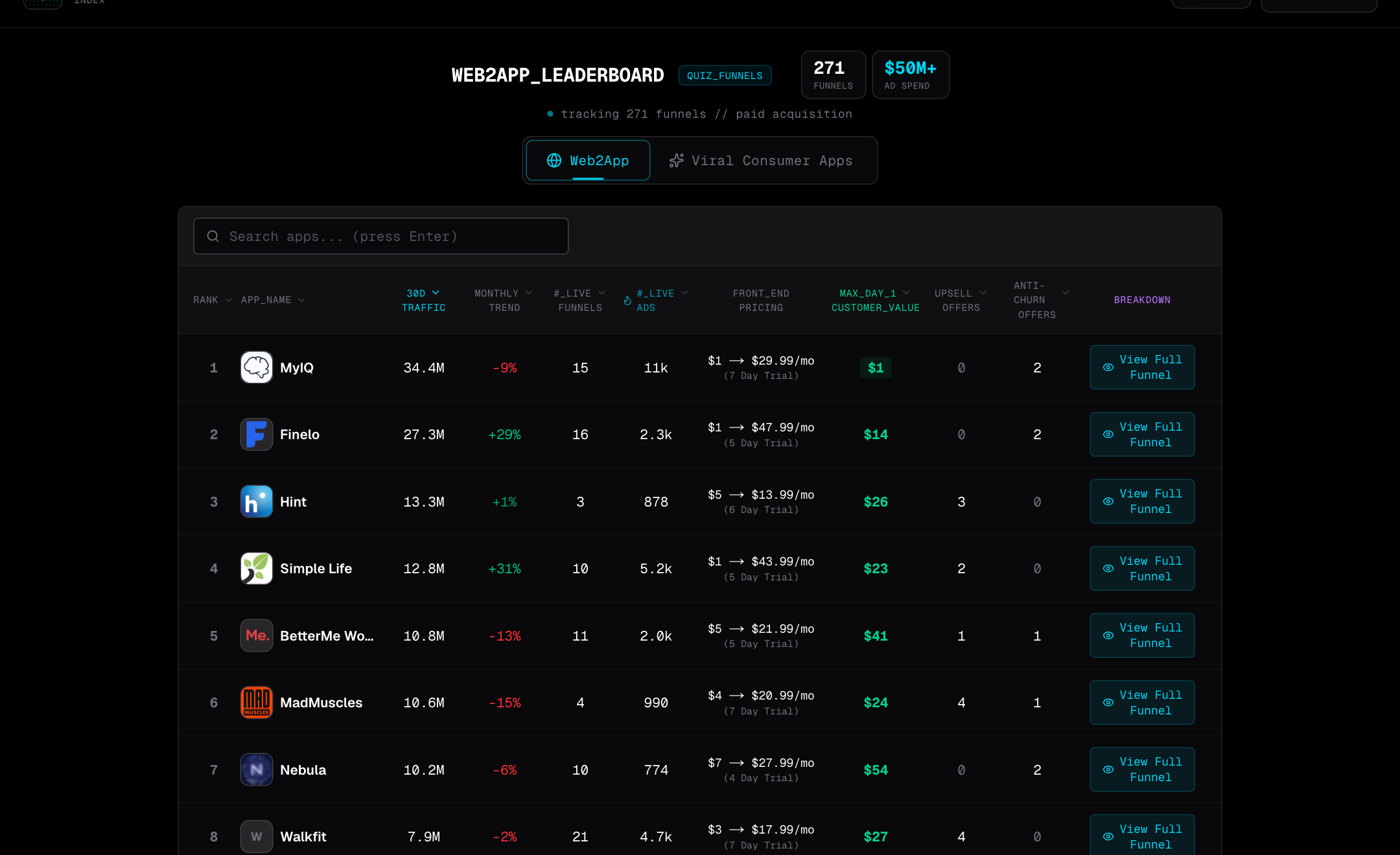
Every one of these angles ends on the same button.
We pulled 119 winning creatives, 71 videos and 48 images, from 12 of the highest-traffic web2app brands. All still live in June. Of the 79 that carried an explicit button, 37 said some version of “Take the Test.” That’s 47%. It beat Shop, Download and Subscribe put together.
The test is a soft yes. Nobody’s buying, they’re just curious, and the price conversation waits until the quiz has already invested them. Hold that in your head, because all five angles below are just different ways to earn that first tap.
Run the quiz inside the ad.
The strongest videos don’t describe the quiz. They play it. A question appears, a finger taps an answer, a results screen renders. By the time you understand what you’re watching, you’ve already taken step one of the funnel. That’s most of why 70% of June’s winners are video or dynamic, not static. You can’t play a quiz in a JPEG.
Here’s a past-lives ad doing it. It opens on Mount Rushmore, hands you a fake input form, types a name and birthday for you, then renders your “result” before asking for a single real answer:
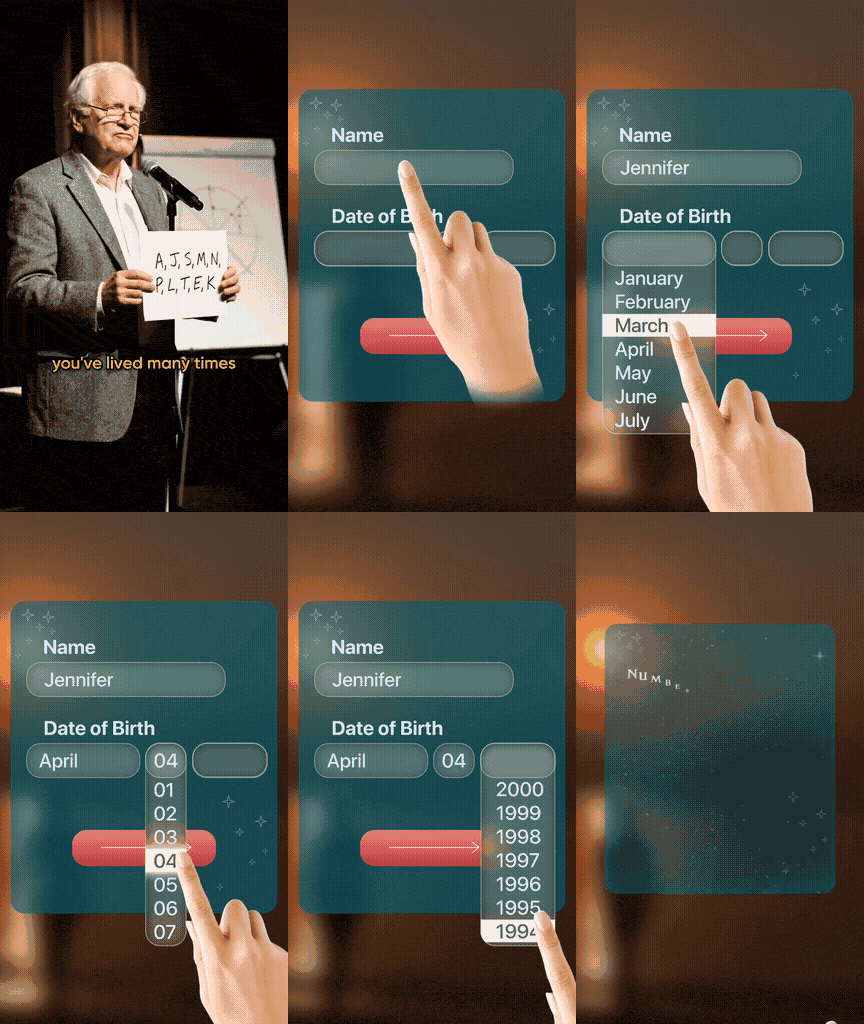
Note the cut at 0:20. The result starts rendering, you lean in to read it, and the button drops before you finish. The open loop is the whole point. You have to tap to close it.
Shoot the quiz interaction itself: a question, an auto-tapped answer, a half-rendered result. Cut to the button before the payoff lands. You’re not advertising the quiz. You’ve started it.
Hand them a diagnosis.
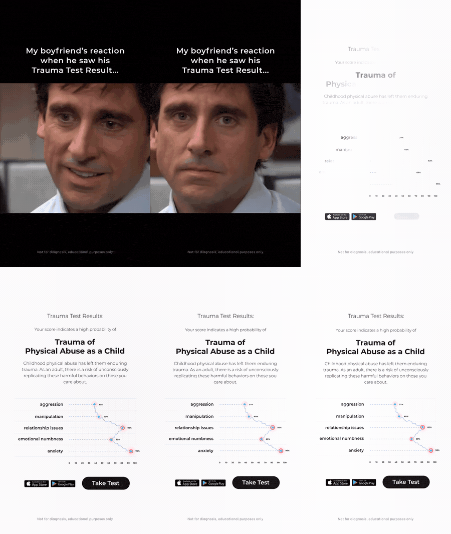
Once the quiz pretends to be a test, the result pretends to be a diagnosis. A named “type.” A percentage. A little chart with suspiciously precise numbers. And then, at the bottom, a tidy “not for diagnosis, educational purposes only” line that somehow makes the whole thing read as more credible, not less.
This trauma-test ad opens on a Steve Carell reaction meme, then renders a clinical results card and a chart that scores the viewer at 95% anxiety:
myiq runs a cleaner, on-brand version of the same idea. A woman in a lab coat holds three balloons and reads you a scoring ladder before you’ve answered anything: “1 to 4 points, high risk. 13 to 15, average. 24 to 25, excellent.” You place yourself on the ladder in your head. The number you imagine is the loop the test then closes.
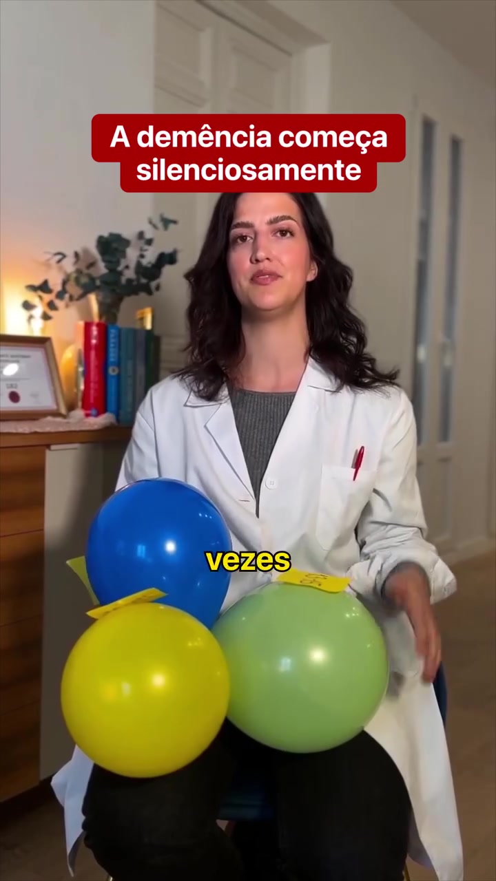
A named type, a percentage, a small chart. The diagnostic costume manufactures authority and a personal stake in one move. Keep the honest “not for diagnosis” line. It reads as candor, and candor reads as real.
Write the first line to one person.
The best hooks don’t promise a benefit. They name a someone, so narrowly that the right someone can’t scroll past. Three that ran in June:
- “FOR WOMEN WHO HAVEN’T EXERCISED IN YEARS” (WalkFit)
- “TO ALL ELDEST DAUGHTERS WHO MISSED THEIR CHILDHOOD”
- “WE’RE LOOKING FOR MOTHERS WHO READ ABOUT GENTLE PARENTING AND REACT ANYWAY”
That last one isn’t an ad. It’s a casting call. The eldest daughter who grew up too fast reads her whole life in nine words and stops her thumb cold. WalkFit’s printable is the cleanest build of the angle. One static image carries the callout, the trend, and a soft ask, with a week-by-week payoff ladder underneath:
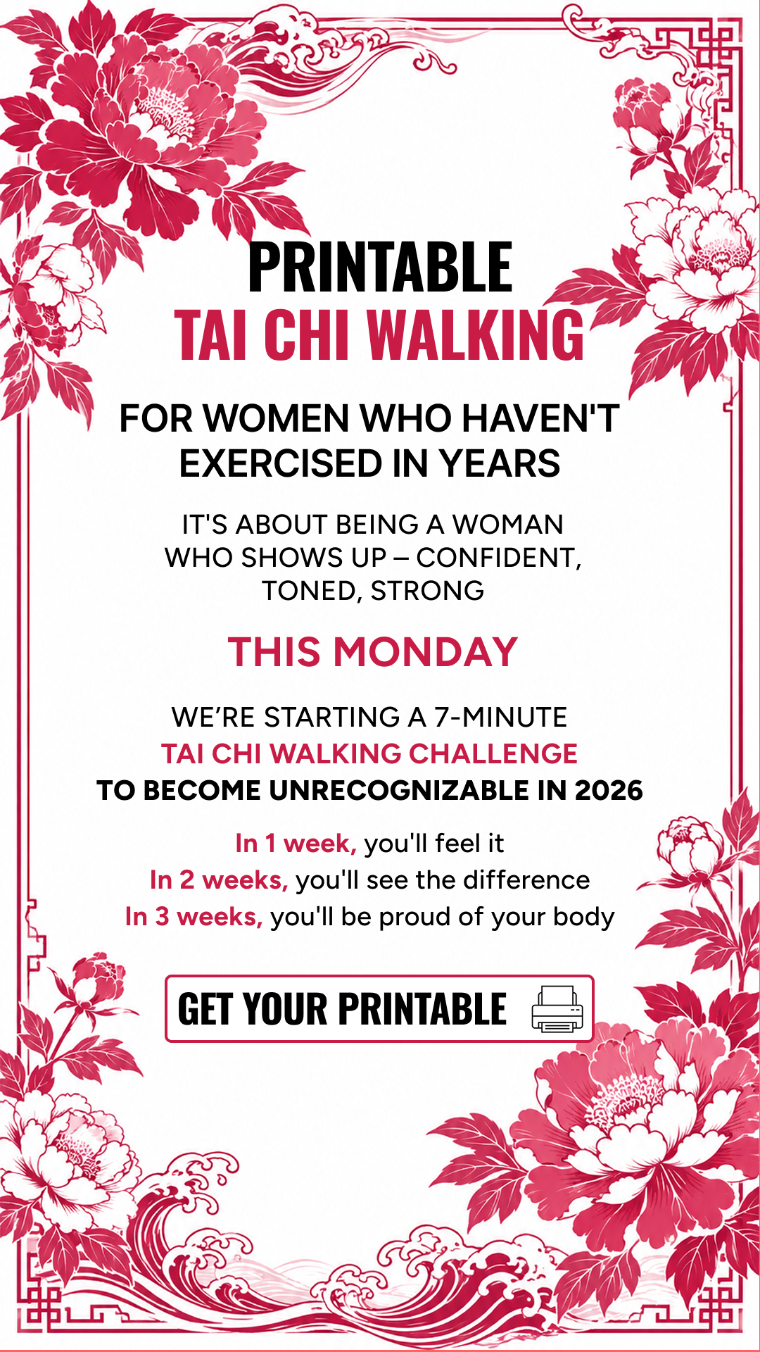
“For women who haven’t exercised in years” out-converts “Get fit,” because the narrower the self-select, the cleaner the lead and the less wasted spend. Then anchor the timeline: week 1 you feel it, week 3 you’re proud.
Promise a reveal they can only get by tapping.
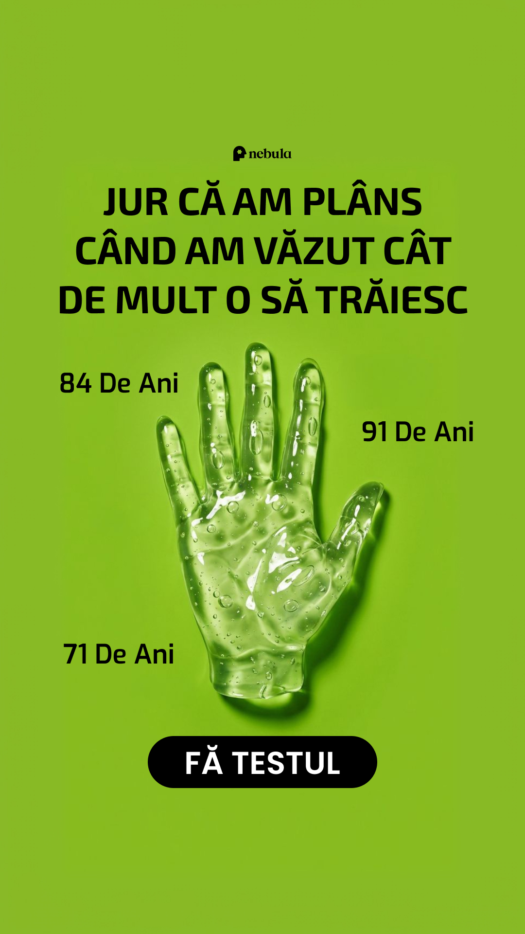
Some offers can’t show the payoff in the ad, so they dangle it. Your soulmate’s face. Your past life. How long your palm says you’ll live. The reveal is real, personalized, and gated behind the quiz, which is the only honest reason to make someone tap.
Nebula’s own palm-reading creative runs the angle as a still. The black button reads FÄ TESTUL — Romanian for Take the Test:
And here’s the video version of the same curiosity gap, from one of June’s soulmate-sketch advertisers. Cloud text in a blue sky, a face forming in the clouds, then the button, all in ten seconds:
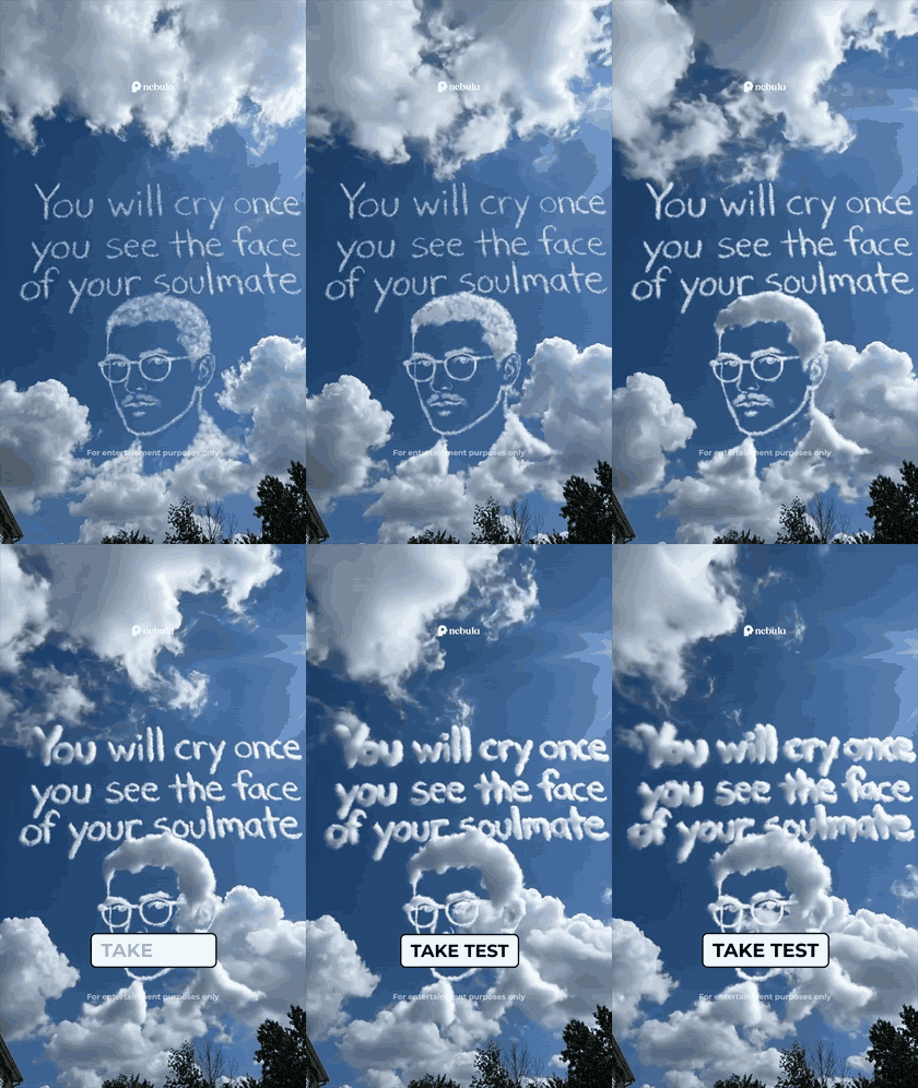
If the payoff is personal — a face, a number, a fortune — never reveal it in the ad. Tease it, then put the only path to it behind the test. Curiosity, not the offer, does the first close.
Cold-open on the secret, or the wound.
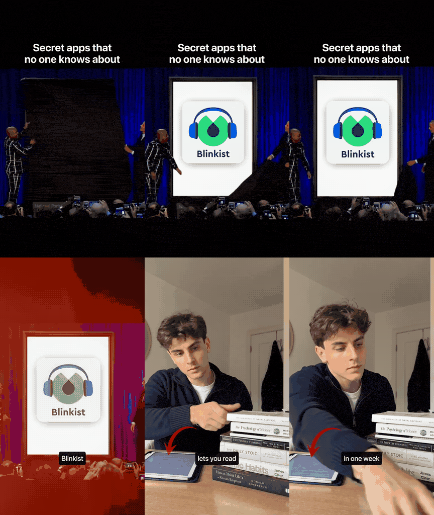
The first frame has one job: stop the thumb before the brain catches up. June’s winners do it two ways. The secret (“here’s a thing the smart people use that you don’t know about”) or the wound (open on distress before you’ve explained anything).
Blinkist runs the secret. It opens on a black card, two men literally pull back a curtain, and the pitch is built entirely on insider framing:
The wound is the darker cousin, and it’s everywhere in the trauma-test lane. One ad opens on a woman covering her face: “If you can’t remember your childhood clearly…” then runs you through a creepy two-tap quiz (“What do you hear first? Hear me / Fear me”) before landing on a result it calls “Memory Blocking as a Survival Response”:
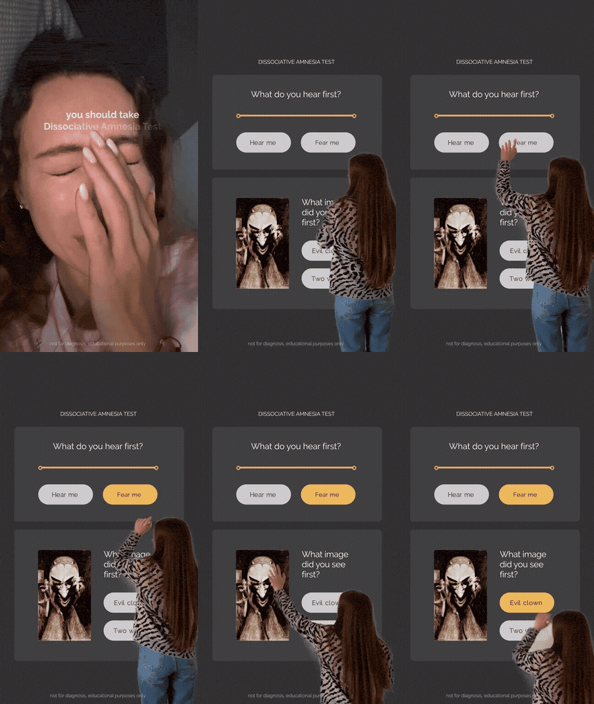
Same family, blunter still: Blinkist’s other June hook is just a profanity pattern-interrupt, “STOP BEING BORING AS F*CK,” stapled to a 42-day reading plan.
Secret or wound, the opening line carries the click. Lead with the curtain or the distress, never with the brand or the benefit. The explanation can wait three seconds. The scroll can’t.
One angle, six languages.
Here’s the part most operators miss. Once an angle works, the top brands don’t just pour more budget into it. They rebuild it per geo. 27 of the 119 winners ran in a non-English language — Portuguese, Spanish, Turkish, Dutch, French, Romanian. The soulmate hook ran in English, Turkish and Romanian. Babbel’s lifetime offer ran clean in Spanish:
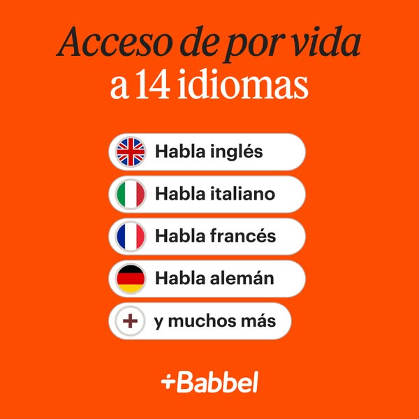
A proven hook in a new language is a cheaper test than a brand-new hook in English. The leaders are scaling across geos, not just up in spend. Your next winning ad might be your current one, in Spanish.
The WalkFit printable
It’s the rare creative that stacks three of these angles into one static image, no video budget required. It names the person (“women who haven’t exercised in years”), rides June’s hottest niche (Tai-Chi walking), and swaps the hard ask for a soft one (“Get your printable,” not “Buy”).
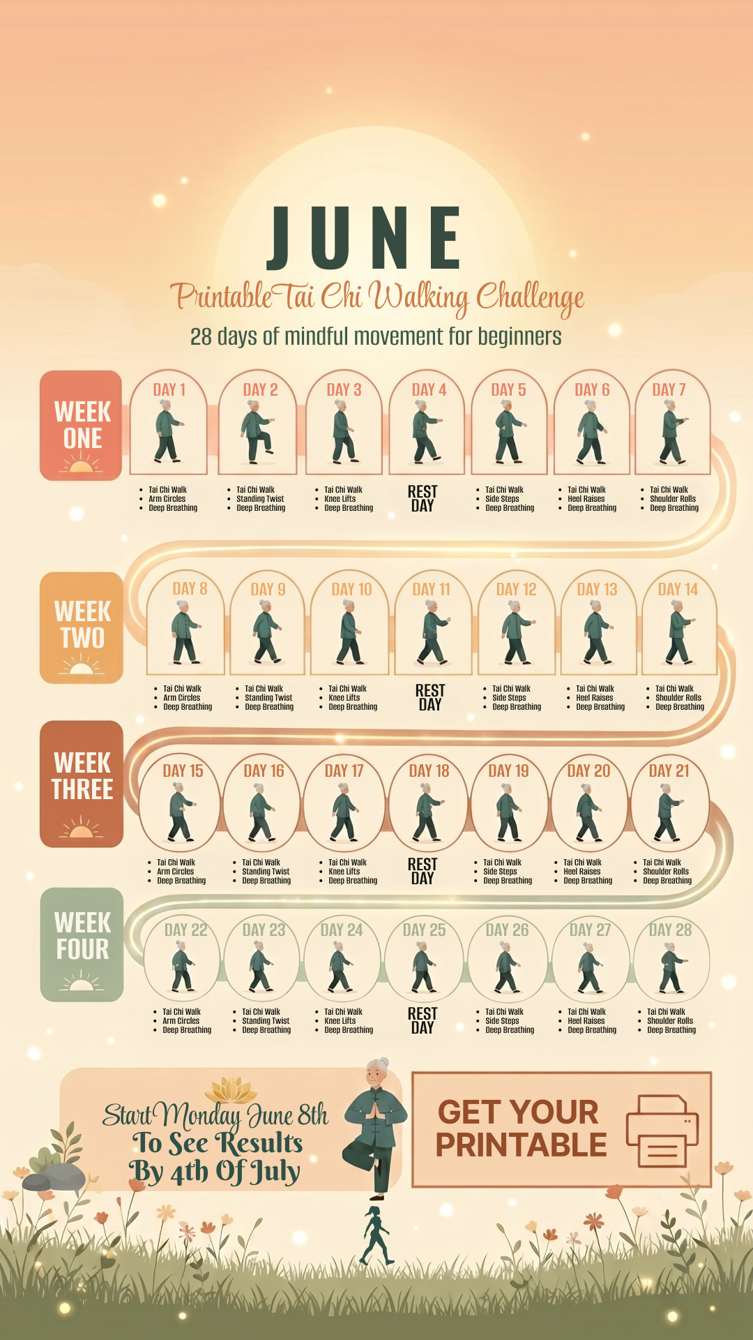
Copy the skeleton: niche persona in the headline, a free downloadable as the entry point, a 1–2–3-week payoff ladder underneath. Then localize it.
We track the Meta & YouTube ads, traffic and full funnel breakdowns for 250+ web2app brands — the same data behind this swipe file. See who’s scaling which angle, live.
Unlock the full terminal →